
The challenge
DocDynamics uses AI to help businesses organize complex documents and prepare them for review. The website needed to introduce that product to people who understand the cost of managing files manually but may be encountering the platform for the first time.
The challenge was to turn a technical subject into a clear, engaging introduction. Visitors needed to understand what the platform does, recognize where it could fit into their work, and find a straightforward way to request a demo.
I handled the WordPress implementation, with a stronger emphasis on animation than in many of my other website projects.
The challenge was to turn a technical subject into a clear, engaging introduction. Visitors needed to understand what the platform does, recognize where it could fit into their work, and find a straightforward way to request a demo.
I handled the WordPress implementation, with a stronger emphasis on animation than in many of my other website projects.
What I built
An opening sequence built around the brand
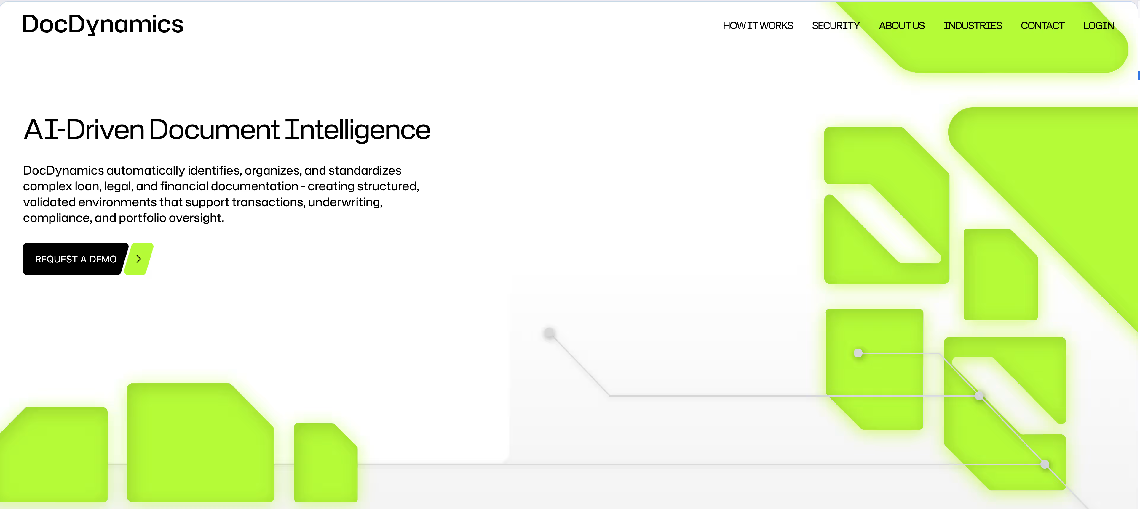
I built an opening sequence using layered SVG versions of the logo and CSS keyframes. A mask reveals the artwork, the logo variations fade through a timed sequence, and the final mark shrinks and moves toward the header as the overlay clears.
The hero illustrations then slide into place from opposite sides. I coordinated those transitions with the introduction and used separate artwork and sizing for mobile, giving the opening a composition suited to smaller screens.
The hero illustrations then slide into place from opposite sides. I coordinated those transitions with the introduction and used separate artwork and sizing for mobile, giving the opening a composition suited to smaller screens.
Connecting illustration to scroll position
For the animated illustrations, I integrated Lottie with a custom TypeScript controller that maps scroll progress to animation frames. As visitors move through a section, the illustration advances with them. Scrolling back moves it toward earlier frames.
In the problem-and-solution section, a sticky illustration stays alongside the copy on desktop while the animation progresses. I configured separate scroll distances and trigger offsets for desktop and mobile to account for the different layouts.
Each animation is configured through HTML data attributes. Those attributes identify the animation, its reference section, and where its progress starts and ends. That let me tune individual sections while keeping the playback logic in one reusable controller.
I used interpolation to smooth the movement between the current frame and the target frame. The controller schedules updates with requestAnimationFrame and uses IntersectionObserver to suspend scroll-driven updates when the section leaves the viewport. It also caches animation requests so repeated instances can reuse the same JSON download.
In the problem-and-solution section, a sticky illustration stays alongside the copy on desktop while the animation progresses. I configured separate scroll distances and trigger offsets for desktop and mobile to account for the different layouts.
Each animation is configured through HTML data attributes. Those attributes identify the animation, its reference section, and where its progress starts and ends. That let me tune individual sections while keeping the playback logic in one reusable controller.
I used interpolation to smooth the movement between the current frame and the target frame. The controller schedules updates with requestAnimationFrame and uses IntersectionObserver to suspend scroll-driven updates when the section leaves the viewport. It also caches animation requests so repeated instances can reuse the same JSON download.
Giving typography its own rhythm
I used GSAP’s SplitText and ScrambleText plugins to give headings and body copy different treatments.
Selected headings appear word by word, combining a short upward movement with characters that shuffle before resolving into the final text. An intersection observer triggers the effect when the heading enters view, and the original text structure is restored afterward.
For longer passages, I built staggered line reveals. The implementation waits for the fonts to load before calculating the lines and rebuilds the animation after a debounced window resize. That keeps the effect aligned with the actual text wrapping as the layout changes.
Together, these techniques gave me control over the pace of the page at several levels, from the opening sequence to individual headings and the illustrations that accompany each section.
Selected headings appear word by word, combining a short upward movement with characters that shuffle before resolving into the final text. An intersection observer triggers the effect when the heading enters view, and the original text structure is restored afterward.
For longer passages, I built staggered line reveals. The implementation waits for the fonts to load before calculating the lines and rebuilds the animation after a debounced window resize. That keeps the effect aligned with the actual text wrapping as the layout changes.
Together, these techniques gave me control over the pace of the page at several levels, from the opening sequence to individual headings and the illustrations that accompany each section.
An editable homepage
I built the homepage with ACF so the team could manage its content through WordPress. The implementation brought the page’s sections into an editing structure that supported ongoing updates to the product’s messaging.
For a technology company, that flexibility matters. As the product evolves, the website needs to keep explaining it accurately. Giving the team control over the content made those updates easier to handle.
For a technology company, that flexibility matters. As the product evolves, the website needs to keep explaining it accurately. Giving the team control over the content made those updates easier to handle.
A familiar frontend workflow inside WordPress
The project used Bedrock as its WordPress foundation, with Vite, TypeScript, and Tailwind CSS in the custom theme.
My experience with Vue and Nuxt made Vite a natural fit for the development workflow. It let me bring familiar frontend tooling into WordPress and iterate on the layouts and interactions as the implementation took shape.
Tailwind helped me keep spacing, typography, and responsive layouts consistent across the page. TypeScript helped define the animation controllers and their configuration options, making the behavior easier to follow and adjust.
My experience with Vue and Nuxt made Vite a natural fit for the development workflow. It let me bring familiar frontend tooling into WordPress and iterate on the layouts and interactions as the implementation took shape.
Tailwind helped me keep spacing, typography, and responsive layouts consistent across the page. TypeScript helped define the animation controllers and their configuration options, making the behavior easier to follow and adjust.
Connecting interest with a conversation
I implemented the contact form through a custom WordPress endpoint, with SendGrid handling email delivery.
On the frontend, I used Zod to define validation rules for the visitor’s name, business email, company, phone number, and message. Field-level feedback helps visitors identify what needs attention before submitting.
The form connected the product presentation with a practical next step for someone interested in learning more.
On the frontend, I used Zod to define validation rules for the visitor’s name, business email, company, phone number, and message. Field-level feedback helps visitors identify what needs attention before submitting.
The form connected the product presentation with a practical next step for someone interested in learning more.
The delivery
The finished implementation combined an animated frontend, an editable WordPress homepage, and a contact flow for prospective customers.
The most interesting part for me was building the relationship between scrolling, typography, and illustration. I could configure how individual sections behaved while reusing the underlying animation logic throughout the page.
It was an opportunity to spend more time on the details of the interface and how the product’s story unfolds as someone explores it.
The most interesting part for me was building the relationship between scrolling, typography, and illustration. I could configure how individual sections behaved while reusing the underlying animation logic throughout the page.
It was an opportunity to spend more time on the details of the interface and how the product’s story unfolds as someone explores it.
What I’d improve next
I’d explore an interactive example using sample documents. A visitor could start with a disorganized collection of files and follow the steps that turn it into a structured result.
That would give the animations an even more specific job. They could show what changes during classification, how files are organized, and where a person would still need to review something.
I’d also like to bring in short stories from people who use the platform. Seeing the documents they work with, the repetitive tasks they face, and how their workflow changes would help prospective customers connect the technology with their own day-to-day work.
That would give the animations an even more specific job. They could show what changes during classification, how files are organized, and where a person would still need to review something.
I’d also like to bring in short stories from people who use the platform. Seeing the documents they work with, the repetitive tasks they face, and how their workflow changes would help prospective customers connect the technology with their own day-to-day work.



